Women Healthcare
Cranberry.fit
At Cranberry.fit, I focused on improving the treatment recommendation page to help users better understand their health assessment results. I began by learning the science behind the symptoms to ensure the designs were accurate and helpful. My main task was designing a new template for 40 different pages, tailored to various symptom types and severity scales. Throughout the project, I worked within the Shopify ecosystem, collaborating closely with developers to make sure the final live pages matched the wireframes and prototypes I built.

My Role
Web Designer
Duration
2 months
Tools
Figma, Shopify, Canva, Adobe Premiere Pro, RunwayML
Overview
/Challenge
The Conversion Gap: The legacy recommendation page failed to effectively communicate the value of the treatment plans, leading to a high drop-off rate after the health assessment.
Trust & Justification: There was a lack of clear "reason to believe," as the connection between the user's current pain points and the proposed long-term solution was not clearly articulated.
/Solution
Immediate Affirmation: Redesigned the hero section to immediately validate the user’s symptom severity, followed directly by a "Future State" section highlighting pain relief and health goals.
Interactive Treatment Timeline: Developed a three-month modular roadmap with an interactive toggle system. This allows users to explore specific milestones for Month 1, 2, and 3, making a long-term plan feel manageable and transparent.
Information Hierarchy: Reorganized the page layout to lead with the "Why" (benefits and outcomes) before the "How" (process and logistics), reducing bounce rates by addressing user concerns in a logical sequence.
Feature Transparency: Created clear informational sections that explicitly detail what is included in the plan, removing ambiguity and streamlining the path to purchase.
Research
Competitive Benchmarking: Conducted a deep dive into top-tier health-tech and wellness platforms primarily solving for women's health to identify industry standards for presenting complex medical information.
Outcome-First Strategy: Observed that high-converting competitors prioritized "the after state" focusing on relief and results before diving into the technical details of the plan.
Mental Mapping: Identified that users needed a chronological "success path" to feel confident in a long-term commitment, leading to the development of a phased treatment visualization.
AI in Workflow
I used AI tools like ChatGPT and Figma Make early in the process to quickly visualize ideas and build rough prototypes before committing to final designs. This helped me explore multiple directions faster and validate concepts with less friction. I also leveraged Claude to refine UX copy for the recommendation page, ensuring the messaging stayed clear, relevant, and aligned with the overall brand voice while still being user-friendly and engaging.

Design
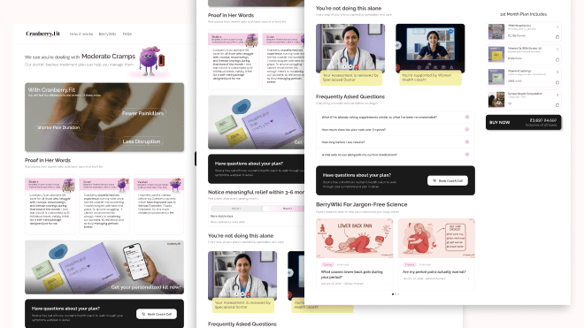
I balanced the complex medical content with a user-friendly layout, eventually arriving at a final design that was both informative and persuasive for users across 40 different health scenarios.
Initial Wireframing: Built the skeletal structure of the page to define where the symptom declarations and the treatment roadmap would sit, ensuring a clear flow of information from the start.
Content & Layout Iterations: Refined the pages by testing how different lengths of health text and month-by-month toggle content fit within the layout, making sure the most important "relief" benefits were always prominent.
Scalable Prototyping: Developed the final high-fidelity design as a flexible template, ensuring the interactive elements worked consistently across all 40 variations of symptom severity.
Technical Handoff: Finalized the design with a focus on developer handoff, ensuring the prototypes were ready for implementation within the Shopify environment.
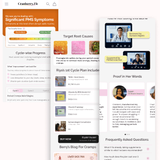
The narrative begins in the dynamic hero section (which you noted changes color based on severity), showing the user's "Significant PMS Symptoms." Key architectural elements I note here are: Severity Scale, Modular Timeline, Educational Cards, Action & Trust Anchors
This iteration focused on optimizing information hierarchy by replacing dense text with icon-led progress cards to reduce cognitive load. The timeline was refined into a "Month-wise Tracking" system to set clear, relatable expectations for relief. I reordered content to prioritize high-impact social proof, moving deep-dive research lower to ensure trust signals appeared earlier in the user journey. Finally, I added a floating shortcut and interactive feedback to provide quick access to personalized recommendations as users explored the page.
The final design prioritizes visual storytelling and emotional resonance by replacing technical data with lifestyle imagery and clear benefit tags. I restructured the page hierarchy to lead with personalized plans and social proof. To support informed decision-making, I implemented a persistent sticky footer with a "Book a coach call" CTA. This balances interactive roadmaps with a polished aesthetic, ensuring a professional yet empathetic experience that guides users toward long-term relief.
Thank you for reading till here. You can visit live project through this link